Click on images below to ENLARGE
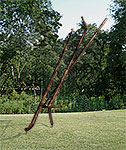
Escape
sculpture concept, bronze, 12 x 5 x 3 ft.
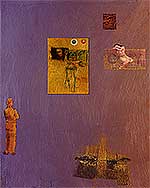
Cassandra's Dilemma,
archival computer print , 15x12 in.
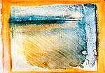
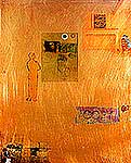
Our World,
archival computer print , 12x17.5 in.
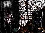
Tenebrous
archival computer print 12 x 16 1/4
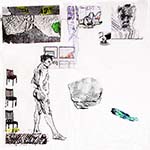
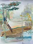
Valleys [In progress]
archival computer print 15 x 12
Valleys
archival computer print 15 x 12
Remembrances for Jane
inkjet, 10 x 8
4'33" for 123 TACIT
6 x 64 x 24 ft
Perormed, March 9. 2009, Puerto Vallarta
Las Meninas
acrylic and collage, 48 x 36 in.Alan,
Alan, Art Storm, archival computer print, 8 x 6 in.
Trees and Pennants
ink on paper, 4 x 10in
Cave Planet
monoprint, 18x18 in.in
Odysseys
ink on paper, 10x14 in.
Mousquetaire, Nature, et Aujourd’hui
computer 10x18 in
A Story To See
computer 10x6.5 in
House design for the Dunes
Delineation
acrylic, charcoal, and collage on canvas, 24x20 in.
Attractions
computer 10x6.5 in
.
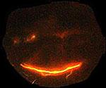
I Am Smiling
acrylic, charcoal, and collage on canvas, 24x24 in
Window Light on Wall
digital photo, 12x12 in
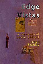
Edge Vistas Cover
Homages computer
What Meaning
ink and charcoal on paper, 11x14 in.
Syntheses
ink and charcoal on paper, 11x14 in
Archaeology
acrylic on canvas, 20x16 in
Outlooks
acrylic & paper on canvas, 24x24 in
Maul Among the Ruins
computer, 12x16 in
Free Uh
computer, 7x6.5 in
Zen Bones
computer, 8x6.5 in
Tracing the Random
48x36 in
And On it Goes
computer, 6x18 in
Long Arch
archival computer,16 x 12, 32 x 24 in
Rock on Pedastal
photograph, 10 x 8in
Artist's Studio
computer
Self Portrait 20090911
ink on paper, 11x14 in (image)
Resources
acrylic, charcoal, and colored pencil on canvas, 48x36 in
Nil Desperandum
computer, size varies
Other Studio Pages:
2004 (Aug-Dec) | 2005 (Jan-May) | 2005 (May-Aug| 2005 (Aug-Dec) | 2006 (Jan-Apr) | 2006 (May-Dec) |
2007 (Jan-Aug) | 2007 (Aug-Dec) | 2008 | 2009 | 2010 | 2011-2012 | 2013 | 2014-16 | 2017 | 2018 | 2019 | 2020
1/10
Early days of this new year have alternated between weather problems, preparing some paintings for loan to the Unity Foundation, doing a little bit of framing, and researching for the oil on brass piece.
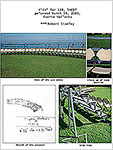
However, I began thinking about sculpture after a discussion about it, and drifted back to the piece I had started in the 1980’s, just after Oakton Community College built its new campus. Workmen had left three handrails in the small copse of woods outside the art studio. I took these, and welded them together, trying several different relationships. Since each one was about 12 feet, it was somewhat difficult to clamp, walk back, check, change.....
The piece disappeared over a summer break, hauled off as scrap by the maintenance staff. Now, twenty-some years later, I worked on the concept again. I came up with “Escape,” a sculpture, this time in bronze, whose ratios and angles resembled the trunks of young trees. I “sited” it at the edge of the copse. These shapes might be escaping the forest, or might symbolize other escapes, of ideas, art, and people, from the safety of their surroundings.
1/14
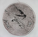
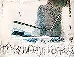
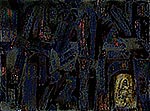
 Preparing work for Koehnline Museum. Snows have kept me getting to studio. Whites of winter and friend’s photo merged into start of new print, “Tenebrous.” Envisioned the transition in upper left. Diptych prints of crosswalk seemed better separated, creating a gap that needs gap-visualizing/thinking.
1/19
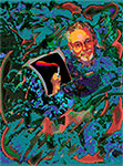
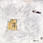
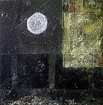
 The continual snow of the last 17 hours has made the roads to my studio dangerous. At the same time, a playful exploration of appropriation inspired by a discussion with another artist, Cassandra Gordon-Harris, about using other’s images has become quite interesting to me. “Cassandra’s Dilemma” is a re-work of “Phoenix.” At first, I put into “Phoenix” some parts of Gordon-Harris’ “Sleepwalking with 3 Moons,” the figure and one of the moons. I added an older piece of mine with one, dark moon, did some tweaking, and was finished with the dimonstration. .
Now, however, I see many deeper presences, ones that I would like to bring out:
We see...what? We compartmentalize. We join the sensual and the mental. Space time is an accessible field. Sad lonliness, glowing lonliness. I’m going to work on it.
1/20
Finished "Cassandra’s Dilemma." I thought it might be interesting to count how many changes/adjustments I made on the piece. I forgot to keep counting at 45. I think, and this is conservatively, there were over 100 decisions. The composition is somewhat adventuresome. In keeping with the spirit of the work, the composition has a “tensegrity” feel to it. I hope the piece, however, is not limited to that idea. It is, however, a lot more unstable than most. As in tensegrity, though, the tensions and compressions are real in both composition and feelings and thought.
1/26
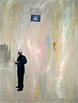
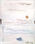
Reworked a painting, “Sides,” for the “Planet Earth Planet Art” book to be published by Mirca Art in November, 2009. The work is a computer print called “Our world." Accompanying it will be these words, fit, I hope, for an enironment book:
“Our world. The universe’s world. A bit of life, surrounded by the energy of the light of the universe, protected, now that humans are here, by the light of our minds. Danger and loveliness, and the implacable movements of nature--in our world and our hands.”
1/31
I’ve been doing much looking and thinking in front of the January 2009 ARTFORUM. Without an updating and renewal of Art’s nearly universal standards, we are lost. Surrounded by the Postmodernist hole torn into that nearly universal matrix of Truth and Beauty, we are left with words, logically true but humanly meaningless, except for those immersed in the current art world zeitgeist.
 For example, Noemi Smolik commented on Maki Na Kamura in the January, 2009 ARTFORUM, “Maki’s works are always somewhere in between...,above all between Western painting and that of Asia...with a naturalness and facility that do not disguise the work’s enigmatic quality.” Now, if the non-postmodern standards of Beauty and Truth were still held, these key words of the review might read, “Maki’s works are sloppy, superficial references to Western and Asian art and world views, mocking the love of the well-crafted that both these traditions have at their cores. Furthermore, there is no real synthesis of Western-Asian space, except in the artist’s words that there is.” But these days, who can rely on standards, when socially approved words are used.
 Still, I think it can be done. In that same ARTFORUM issue, Donald Kuspit does use these standards on a contemporary work, to good effect. Speaking of Elizabeth Neel, Kuspit pegs the work: “Neel is at her best...in the sense in which Hans Sedlmayr says that the interesting has become the substitute for the beautiful [italics mine]..” Earlier Kuspit pointed out Neel “sidesteps the challenge” of Rosenberg’s standards, which were just an updating of standards that can be linked to art around the world, as Modernists wanted.
Truth, Beauty—FORM with all it includes—do not stultify. Today’s individualism and identity art stultify. Form, moved forward to the current era, breathes life because it gives us all a common language to use in our agreements and disagreements, our esthetic sadnesses and joys.
2/3
Finished Tenebrous. Started with a dialectic between the foggy trees and the darkened poles and crosswalk. It has some areas that I’m not sure about. Are they throw-backs, or something new? Among these are the closer integration of main field and objects, feathered edges, door-like shapes, geometric/biomorphic dynamics. Although this one doesn’t send a zing through me, I think I have to let it exist, until I know whether some new things are emerging.
2/7
While three works remain unfinished, I’ve found two more new things I want to work with. One is a 1930s, sepia photo of a newly married Guatamalan couple; the other, the texture of a towel.
 Edges Amid Pinks, acrylic on canvas, 12 x 31 in.
Also made a discovery. In looking for a work to take to a Valentine’s party at Paul Henry’s Gallery, I discovered “Edges Amid Pinks.” This work, from forty years ago, is still crisply linked to my current thoughts and feelings. I wonder if this discovery will go anywhere.
2/12
Went to see “Disegno” exhibition at the Snite. Somewhat disappointing, as the works were mainly from the Academic end of that movement. Disegno was the wonderful realization that artists were to combine the highest skill with imagination and reasoning to create a whole. Still, even though many of the works, from the 16th and 17th centuries had become formulaic, some were quietly exhilarating.
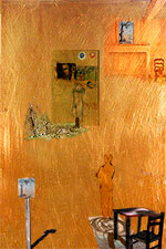
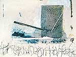
Have been working on the piece with the couple and a towel (2/7). Now called “Valleys,” it’s beginning to have some of the gravitas that Disegno works had, I hope. Distorting the couple’s photo added movement, to fit in with the aerial view of the valley. Adding a red road made travel and human involvement more evident. High ladders mean something along those lines, also. A spike-heeled shoe, blood red, inverted at the bottom feels right and helps the composition--disegno! Not quite contrasty enough nor unified enough. Resolving these oppositions is a fine challenge.
2/18
Finished “Valleys” with two hours of tweaking. The red spike heel, geometric lines, and the red road are stronger. The woman holds a red-touched book. The red-linked ambiguity of lifeline/road and of danger are now stronger, as is the “escape” from the ambiguity of life via the ladders. By weakening the valley and moving the couple, the whole is now more dynamic, which is how I see things. The background texture suggests lines of force, as can be seen on the surface of the Sun. Chaotic yet orderly
Three exhibitions in May, one, a solo, are keeping me busy selecting, making, framing, writing. Jane has been chief curator on the solo. Five pieces in the invitational were picked by the curator, Jim Panos. I picked the one for the UD Alumni Exhibit, but have no idea what the other artists will exhibit. These three shows will give me a chance to see my work in a new light, so I'm looking forward to them.
2/22
Working on a small book tracing the changing expression of my art and poetry over the last forty years. Selecting, layout, editing, editing, editing. Six friends with expertise in various areas have given very helpful critiques.
2/28
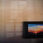
Just got an inspiration from images sitting on my desktop. From Jane’s descpriptions of Wasega, Ontario and the cast light from a window, I make this. Tight color balance, loose composition and associations.
3/26
It's been a busy time. I'm getting ready for one solo, one invitational, and two group exhibits. While involved with the show prep, I've managed to make some sketches and collect a dozen resource photos, however.
Also did one installation/performance, 4'33" for 123 TACIT. I like it because it is beautiful and it smacks the Dada-istic art which still thinks, thanks to folks like Cage, that it's important to frappez le bourgeoisie.
Also have finished, I think, Las Meninas. It is involved with art history, while still being about the flows in existence, I have put in Johns’ reference to these things (from “Untitled 1992). Velazquez’ "Las Meninas" is a painting about representation, as is mine. Also, all the things in this piece are "Handmaidens" ("Meninas").
3/31
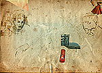
Finished
"Alan, Art Storm." Done for the Director of the Evanston Art Center. Jumble of chaotic forms, with Alan demonstrating something being marked into nothingness.
Also working on the poem/art book, Edge Vistas. I’m at the stage of confusion, when the original idea is overwhelmed with all the possibilities. Soon, if the usual course opens, there’ll be a re-focusing.
4/8
Actually brushing paint on canvas, between all the prep work for shows. I am happier. Some of it was just skill work, fixing up an area that didn't work; but some was music.
4/16
In the past week, I’ve designed a cover for my town’s directory. Made some cards. Designed the announcement postcard for my one-man. Visited an art center, where an artist looked pretentious and ugly-ish in the first piece I saw, then amazed me in the next two, and finally showed me that he had lucked out with the two good ones, as the remaining ten or so careened away from conflict and surety that makes good pieces. How does that happen?
Also discussed Great Decisions at the library. And sat on a review panel for artists’ grants.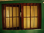
![]()
 The only things artistic I did, besides the usual stuff of looking at the world and composing, were two slightly manipulated photos. I think all’s well.
4/20
The drawing “Trees and Pennants” came from a shopping center visit. Later, I saw a photo of lightning that led to “Evil Pumpkin.”
Shipped off an artwork to University of Dayton gallery.
Pieces in the studio still unfinished are coming together in my mind, although I can only see the start of the finish.
4/27
Hisamatsu's Seven Characteristics of Zen are Asymmetry, Simplicity, Austere Sublimity or Lofty Dryness, Naturalness, Subtle Profundity or Profound Subtlety, Freedom from Attachment, and Tranquility.
Hisamatsu Shin'ichi, Zen and the Fine Arts, trans. Gishin Tokiwa (Tokyo Kodansha International, 1971), p. 45.
quoted by Alexandra Munroe, The Third Mind, Guggenheim Museum Publications, 2009, p. 27, footnote 25.
5/2
The making of Odysseys, ink on paper, 10x14:
I came across a drawing of my mom and dad that I’d done in the mid-1970’s. Liking the way the looks seemed to capture the history of their lives, I scanned it, and sent it to my extended family. Next day, I thought that the cover of the sketchbook, time-riven, looked good too. So, I scanned that. The next day, I thought that bringing together the sketch of my folks and the sketchbook cover might be interesting. By the next day, it was.
I enjoyed the adding, scaling, drawing over, tuning up, composing--like an orchestral practice. Or, more accurately like a time-warped jazz moment.
5/7
Finished Mousquetaire, Nature, et Aujourd’hui computer 10x18 in.
Christie’s just auctioned Picasso's “Mousquetaire a la pipe” for $14,000,000.00. This inspired me to make “Mousquetaire, Nature, et Aujourd’hui,” in which I, Picasso, and Nature regard each other. Picasso is placed in time, the gradient yellow different that the solid yellow in his original. His figure looks somewhat to the left, where nature appears as a wolf-image. But, since Emerson pointed out that a brick house is also nature because nature, in human form, made and laid the bricks, I suppose that the pixelated, information-filled image behind the wolf is also nature. Meanwhile, the railing out from the walls we find ourselves behind (although we hang the works of artists like Picasso on them, as seen in the partial frame)--the railing/guide is....Nature!
At least, that’s what I think I was sensing as I made the piece.
5/9
The book of art and poems is getting closer to being finished, 42 pages of about 60.
5/17
Finally, the solo exhibit has opened, and I can do more art making.
5/20
Finished a piece for an online cooperative narrative, “A Story to See” (http://astorytosee.com). The artwork is more narrative than most of my work, but it was engrossing once I got started, and “led me” in new directions as I worked on it. Journey, sex, completion, life are metaphors for each other.
Even got some painting in at the studio. Also made art resource photos: two of which I used in “A Story to See,” the weathered signpost and the old concrete bridge in the middle of a marsh. I think I’ll be using the bridge some more.
Other pics I've recently shot for use in my works include a tree fallen against another tree, driftwood and deflated balloon, large black flotsam, inflated pink balloon (chiaroscuro) on beach, light on sidewalk, glare of city sunset across eight lane freeway, light from window on wall.
6/3
Wonderfully all over the place. Picking up work from show. Shooting more art resource photos. Discussing art pricing nationally via Facebook and collaborating internationally on an Aung San Soo Kyi poster. Enjoying the late Spring, even if it means burrs galore in the dog fur. And winding up the book, with ISBN and Library of Congress Numbers obtained, final design review and indexing left.
Did a cover for a Michael Morris’s play, Dreams of Sal Mineo, which was so ultimately together although multi-layered and multi-directional that ideas overcrowded my brain.
I’ve been working on a chair, a tree, and two boys walking--all in a nearly finished painting. The tree was technically fine but merely adequate, until one root spoke to me about reaching out nakedly. The solid chair, I enjoyed rebuilding in swifter strokes. The boys, I really enjoyed struggling with. jive-y, lively, yet nearly gone.
6/4
Designed a house for us to build here in Beverly Shores.
6/5
Finished Delineation, acrylic, charcoal, and collage on canvas, 24x20 in. Time, grittiness, sublimity, communication, and Art’s attempt to communicate with them, the artist, and the viewer--are all mixed in. Paint scraped off, sidewalk falling apart, beautiful colors, picture of DNA under SEM, and drawings try to delineate and de-line (boundary) experiences.
6/10
A one-inch repro of my painting “I Love You, I Am Smiling” was lying around the studio a few days ago, and I got the idea to use it, off to the side, like the old painting “As An Owl Among the Ruins” that I had just shared. Starting in, I did a pastel pastiche of greens and ochres around the edge, with a speech balloon (for the “smiling” face) of deep blues, umbers, and ochres. Looked like blah.Scraped the pastel greens back to some canvas. Blah.
Going over the work before I fell asleep last night, I recalled my friend Kathryn’s comments about liking the way I was working with subtly-hued whites. So, in my mind, I painted that. Didn’t work--too pretty. Painted gray. Didn’t work--too boring. Painted white--might work, with the deep blues coming through the light paint.
So, that’s what I did when I got to the studio today. Didn’t work quite right. The blues didn’t come through much, but that’s when the work took off. The white strokes themselves demanded a counterpoint, in white, again. Some areas needed to contrast more subtly. Better. I could see the smiling head fitting in.
But still.... Then, I went back in with the brush handle, making not-quite-random, calligraphic chaotic strokes. Now, the process was WORKING! The print of the sidewalk and chair I prepared several days ago to collage (by stretching and covering with medium), seemed better as a charcoal drawing, fresco-like, right into the still-drying paint. Right! The mysterious intrusion in the photographed sidewalk didn’t look right after I drew it in. So, I rubbed out the perspective, and re-drew it, incised in charcoal pencil, using a T-square, some trace lines floating in the larger painting itself.
I put in the smiling face, and the whole thing is working. Have to collage the “mountains” of yellowed paper and the test strip of fragments of a computer print. But, the thing is working!
6/11
Considering my plunge into and changes made to the “I Am Smiling” piece (6/10/2009), I was thinking about the deep involvement an artist needs to make good work. Is this lack the reason so many Biennale and Dokumenta works fail?
By fail, I mean, don’t move me, and don’t move most human beings. If one knows art history and the current art scene, all works of these and other “high” shows are interesting. But...without dedication to the human condition and hard work, art is dull.
For example, Sharon Core’s photographs of cakes “comments” on Thiebaud, but without even his questioning of expression and the common. No human condition in her work; but plenty of art cognoscenti “get” it. I think of others, who make LED sayings (Holzer), cut up animals (Hirst), play with art trends (Richter)--none of which seems deeply involving for the artist--more just “executed.”
No wonder fine art is not a cultural force. Coupled with the simplistic overemphasis on the artists’ narcissism and identity concerns (like, do artists think the public is aware of self and identity problems?), the lack of real skill being challenged and changed, of INvolvement cripples such works.
6/15
More work on “I Am Smiling.” 210 Million-year old mountains I’ve walked on, the Appalachians, represented by weathered paper silhouette. Put in the Swimmer, becoming an often-repeated theme for me. A slice of computer test print, containing an ancient rock, rectangular golden light, mysterious stuff, and myself got torn and attached, rather than kept clean-edged. Washed into the chair area some ochre-yellow-sepia-green, leaving the pristine rectangle alone. The piece is becoming a zoom-zoom/eternal dialog.
The ancient rock and mountains make me wonder why I haven’t done more with the crinoids I’ve collected. Going to start a computer piece with something crinoid right now.
6/17
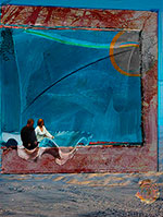
Finished the computer piece, Attractions, after some valuable feedback from KA. This was the piece that started with crinoids. Crinoids didn’t inspire, but the other scraps I collected, shells and sea, started to work. Then the “Venus” shell begot the idea of lovers, (because of Botticelli’s painting). They needed a place to “land” metaphorically and Form-wise. One of the shots I was considering had twisted branches, which fit as a border. To the now-rainbow extension/overlay of the blue-field painting I had put in with the ocean. Shell (spiral) had to be moved and re-colored to fit in yet be the key. And more stuff..but it finally all fit.
6/18 Working on commision, 6 Degrees.
6/19
Finished I Am Smiling by touching up the chair and color around it.
6/24
Started a new piece. Began with a sketch I’d made of some saplings seen in a floating perspective on a Winter’s day in a shopping mall parking lot. Then a window (“oops--missed seeing something?), which became the aluminum-framed window of my room as a young Brother. Then a scrap from a silkscreen that resembles a dark early morning. Nothing is pulling it together yet.
6/28
 Modest adventures today.
6/29
The piece I started last week (6/24) did start to hang together today. Instead of the somewhat wistful or morose feel that generated its beginnings, I felt like flooding the piece with an ochre wash, which suggested some cad yellows and cad reds. All nearly imperceptible, but changed the tenor. Now, the separated, off-kilter landscape will be moved to the window, which I will paint over the landscape as a failed attempt to “capture” nature with a view, even one out a young monk’s “cell.” I think I'll call it “Outlooks.”
Looked at the four finalists for he £30,000 Aspect Prize, one of the largest prizes for painting in the UK. Also checked out the finalists for several years previous. Most are nearly indiscernible from myriad art school workovers of what’s been going on. Sad. One, Scot Sinclair, shows some promise of tackling today, self, and Beauty.
7/2
This photo is from my last exhibit. The longer I looked, the more I saw and “fixed.” References to landscape, Romanesque order, geometric order, the place of art in the world----a lot of aspects resonate for me
7/8
The last three days have been spent almost wholly on finalizing my poems/art book, Edge Vistas. After a second round of proof-reading, with invaluable input from Heather G-B, I fixed spacing in title/description captions, rewrote the Forward, built table of contents, redid the title page (thanks to Jane I really looked at something that had disappeared from my mind), and refined several layouts. It’s gotten to the stage where, like painting, I can barely feel it, and nothing bothers me as not belonging. I know it’s the best I can do, practically speaking. When it comes back from the printers it will likely be “new” again, and I can get excited again.
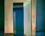
7/9
While scanning in some old slides, I saw possibilities in “Doorways” because it could be manipulated into a relationship with the wall and curb it rested against, in the days when I didn’t know how to shoot art. It’s called “Doorways Revisited.” After several hours, I am not sure that I like it, since new ideas didn’t arise–it’s mainly a re-jiggering of old techniques/styles, with only a few inspiring areas showing subtle opportunity one for warmth, one for disorienting adventure.
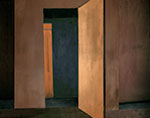 Hallways Revisited computer
Eventually, I got it around to where I like it, calling this “Homages.” I think of Diebenkorn, Rothko, Hoffmann, and some Asian esthetics.
7/13
I have been working on photographs (slides) I had from early days.
Also working on the painting “Outlooks” (6/24 & 6/29). It got a violet glaze to burnish the yellows after a vigorous action painting episode. Now, I am adding areas of paint that suggest Johns’ hash marks, the areas suggesting a landscape. I think the "burnishing" may be just boring.
7/15
“Outlooks” gets closer. Tinted the overall field more yellow, and have added the “landscape.”
While taking a coffee break, I noticed again the old painting “Dark, Blood, Light” as part of it peeked out from a stack of works. It has always bothered me, but seemed an honest work-of-the-moment, so I’ve left it alone.
Now, I got an inspiration to cover it in white, turn it, and draw back into it while it was wet, calling it “Archaeology.” Which I did. And, it’s working. The sgraffitto makes sense esthetically and intellectually.
Archaelogy acrylic on canvas 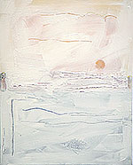
Which led to a bother. Why didn’t the Zen-like, “honest mark” earlier painting work? Some, done in that mode, have, like “Lent.” And, why do some of the other artists who were influenced by Asia make “Zen” pieces that work for me, and some, don’t? Whistler, Dow, O’Keefe work. Dove and early Marsden don’t. I think the esthetic filter has something to do with it. I think the ability to really sense and not just sense to sense (similar to the difference between real love and loving to love) have something to do with it. Is there an objective way to judge, by pulling together, say, 100 respected Zen teachers, and asking them to point out the works that best reveal “non-self mind?”
7/17
Wrestling with the surface color for “Archaeology.” (7/15) Right now it’s too light in transparency, color, and even texture, I think. However, don’t want to make the archaelogy concept an illustration. Experimenting with gesso-titanium white mix and earthy, but not obviously so, colors. Digging back to the original sgrafitto IS a bit like archaelogy.
7/23
Finished correcting the proofs of my art/poetry book, “Edge Vistas.” Should be printed in a week or so  Also okayed my contribution to the book ‘Planet Earth, Planet Art’ which will be published in November. All proceeds to the book are now going to Friends Of The Earth International.
Been scanning in a lot of old drawing slides, too.
7/24
Exploring a synthesis of Zen and Western consciousness, especially in making marks. Fluxus, Kaprow, Guston, Marden and others mistake, as I see it, accident and spontaneity, unskilled, as the “real moment.” Those who say, in essence, “just do what you feel like,” usually have meant “do it AFTER you have gone through a lot of training/work. I’m exploring marks and meaning in “What Meaning:”
7/27
Finished “Syntheses,” renamed from “What Meaning” (7/24). Eliminated some areas to recall a window. Has many syntheses, from world view to media.
Also added paint strata to “Archaeology.” Did various uncoverings back to the marks, and these uncoverings are good. But, the surface is not quite right; lumpiness and strokes are fine, but the white?
7/29
Finished Archaeology, acrylic on canvas, 20x16 in. Four layers of different whites, the final one laid on as nature lays down a layer of sediment. Did a few different kinds of sgraffitto back to the images. The abstract flow in the center now reveals all three colors, and implies the living via red. Finally, simple enough and complex enough.
8/1
The arrow I’ve shot at “Outlooks” (6/24, 6/29, 7/13, 7/15) has veered away and hit the target. Perhaps a better analogy would be that the arrow bored right through the bull’s eye, and struck the bull’s eye behind it.
I’ve painted in the window that partially covers the rectangular green and blue, landscape-suggesting silkscreen fragment. The painted hatch marks are working in the abstracted cloud-sky-land fragments. But, the real finish was not doing anything to the trees in the upper right. They had all but disappeared under the various painting and glazing done after I first brushed them in. Their tenuous appearance draws the eye to both a compositional spot that releases back to the “window,” and leads the eye off, into the “real world” that is just as tenuous as the painted trees.
8/5
Finished "Outlooks," acrylic and paper on canvas. A little glazing, and all’s well. I like the "landscape" where I push Johns' strokes even further into Zen and American at the same time:
8/17
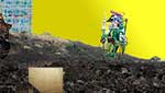
Sad. Feeling let down by some close to me. I usually don’t do emotional exorcisms, but... *Did Maul Among the Ruins, computer, 12x16. The title comes from a very early watercolor, “As An Owl Among the Ruins,” taken from a Psalm. I’ve become the owl (me-owl), “Maul.”
8/24
Been delivering paintings to gallery, and books all around, leaving time only for sporadic inspirations, like these two that came from seeing a picture on Facebook: * Free Uh, computer, 7x6.5 in * Zen Bones, computer, 8x6.5 in
8/26
Recently I’ve been asked a lot “how do you start/make your works?” I just started one today; and I think I’ll use it as an example for those who have that question.
I pulled out a 4x3 foot canvas, because I’ve been painting a lot of smaller ones lately. I thought I’d just start with random charcoal marks, and see what they suggested, tentatively thinking some recent drawings or “resource photos” would pop into my head.
Then I saw “I Am Smiling” (6/19/2009) nearby. I decided to generally copy the random incisions of that piece, knowing that the move from square to rectangular and 2 feet to 4 feet would spark something. As I carried “I Am Smiling” to the easel, I also got the idea to trace its square outside into the new work.
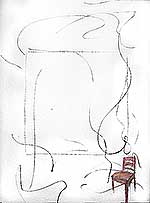
Great fun, like improv jazz, to “repeat” the random strokes in the new piece, in charcoal. Added a few marks, too--of course. After tracing in the square, just a little off center, I thought that scrubbing into that square with white pastel. Now something was happening! More charcoal and white scrubbing.
Idea: put in the chair that has been iconic for a while. Charcoal not too good. Colored pastel. Better. Scrubbed with white. Better still. More pastel. More scrubbing. Good.
I do not know where this all will go. Originally, I thought not to leave the main field white, since I’d done so much of that recently. Didn’t know where the “random” lines would lead, but liked the idea of random and color. Now, I’ll let the idea germinate, and probably flip through some sketches and my “art resource” photos.
Last night finished “And On It Goes,” a computer piece that came to me as I was just thinking. It’s the most recent two computer pieces, “Free Uh” and “Zen Bones” (8/24/2009), one flipped, and then both massively changed and adjusted, even though it doesn’t much look like it at first.
8/28
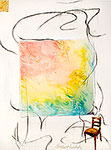
Think I’ll call the new painting (8/26) “Resources.” As I was painting some variations in my head last night, the right idea seemed to be to wash colors in the central area, colors like those of “Birth Edge.” 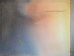 As in that painting, the colors here would resemble the dawn and the beginning of universes and selves. The idea got better as I considered that the colored square could be a sunset as well, thereby creating that space I like, the kind that goes out of the painting. While looking at the “sunrise” in the painting, the viewer could be thinking of the “sunset” occurring behind him.
As I was working on this today, things happened. Working towards a smooth gradient, I thought to work with the imperfections rather than smooth them. Many paper towels, wet rags, spritzes, color adds, and perspiration (literally) later, this area had developed into something more interesting that I first envisioned. Besides looking better, it suggests biological processes, and landscape forms emerging from energies.
Originally, I was going to keep the charcoal-on-gesso outer area, and paint the chair. Now, who knows what will come up as I start to work. Resources: the universe’s, mine, the painting’s.
8/29
I'm in an extensive and unsuccessful struggle to get some elements working in a new computer piece. I've got the Duomo, some shots of a city beyond columns, an up-angle shot of Michelangelo's "David" that shows some of the dome above it, and my work "A Hand." Thought it couldn't lose, and would be an interesting challenge: Duomo, Renaissance moves on, the arch of the David rotunda, the arch of my piece with its hand in a different mode than David's. There's no hold-together emerging yet, just combating images without significant placement.
8/31
Spent most of yesterday afternoon and late night, finishing the computer piece of 8/29. It started to click in when I turned Michelangelo’s David upside down, and twisted the dome above it to fit the arch of my print “A Hand.” Then, the hold-together appeared as I put a glow of light in the dome. This light appears throughout, from the beginnings of time to the muon. I will call it “Long Arch.”
Many in Chicago and the art world get ecstatic over the Eliasson exhibit at the Museum of Contemporary Art. I found this out after I had finished “Long Arch,” and it led me to think of how small Eliasson is, although the scale is large. His work is very beautiful, of course. But, his concerns are just a small part of my art. In the stone above the reaching fingers in “Long Arch,” there’s an Eliasson glow, as a round energy rainbow. I also have Michelangelo's David, Renaissance Florence, ancient man, and the random meaning of the modern world. His light glow is a small part of the world. I still hope for, and see some artists’ commitment to, Beauty and Truth. Outside of Johns, Kieffer, and a few others in the current art establishment, one sees some of one or the other, but rarely a solid whole of both.
Started a pastel and pencil on 12 inch piece of slate. Two squares in/on the slate interested me, being “perfect” while the slate itself had the random order of a natural object. So far, have a grid of figures facing away and a sun-moon emerging from a triangle in the corner. Don’t know what will happen with the squares.
9/8
Richening the soil through discussing with artists and curators what's significant about my art and art in general, and shooting nearly 100 photos, silently churning ideas of nature, self, and culture.
9/10
Well, damn. I thought all the “richening” would produce something special. What I made were two things, neither of which I particularly like.
 “Stilled Tempos” is pastel, colored pencil, and acrylic varnish on slate. It seems to me too much like an illustration.
“Artist’s Studio” is a computer piece that is smart but unmoving.
9/11
Worked on "Stilled Tempos, mainly using acrylic varnish to contro thel values on the slate and the color saturations. Works well for me now.
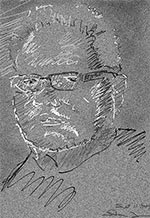
Made a late night self portrait, because I wondered how wielding a pen on a computer pad would work. Pretty well, I think, because my mood at the time needed expression, one of the more difficult things to get honestly with computer tools.
9/13
Invited to exhibit in Rostow-on-Don next Spring.
9/18
 Some exhilarating painting on the chair in “Resources.” (8/26, 8/28). Is the painting full enough? The composition and painted areas are. Going to mull over the whole entity. Got an idea to share it with those interested in my art, via internet, as “So You Want to be a Critic!” See what folks say, because I know the “groove” is entrenched in my mind, so comments won’t divert. If a piece is just started and REALLY unfocused, comments can derail me.
Got an idea for an exhibition proposal: “All Inspiration is Local.” Photos I’ve taken around home, with the implicit or explicit idea that the locus of creativity is located in an artist’s person, and not “out there” in pretty/clever visual attractions like sunsets or abstraction-for-abstraction, nor in something outside one’s own mind.
9/21
Finished off “Resources.” (8/26, 8/28, 9/18). I read the emailed critiques. Then, as I planned, I put them out of my mind. The next day, I walked into the studio, and looked at the painting, to see what it “needed.”
10/1
Finished “Nil Desperandum” ('never despair'), a proposal for Knill House, St. Ives, Cornwall, May be print edition, or used in the multi media environment being planned by the curator, Sally Noall.
10/2 I now undestanding more the meaning of someone not caring.
Started a painting incorporating tattered remnants of a frame from my old piece “Kyrios,” which was resurrection-themed. I am putting an image of myself the artist in the same spot as Velazquez put himself in “Las Meninas” and I put myself in my “Las Meninas.” (3/26) Handmaidens indeed.
10/3
I am not going to publish my studio log any more.
![]()
![]()
![]()
![]() Previous
Previous ![]() Top
Top